
Category: Units 1+4
Macro Best
The reason why I like this particular image is the composistion of it, the way the camera has focused on the minute cracks and paint peelings coming off of the rusted bar. The way the background is blurred right up to the edge of the bar is satisfying. This image is slightly different and a little more interesting as the middle ground is sharp, crisp and in focus whereas, the foreground and the background are completely blurred and hazed. The textures of this image portray a rough, corrosive sensation where as in reality, the piece was smooth and gentle. Having to look closely at the image, and still not knowing what it could be or where it would have been taken, makes this photogrpagh even more interesting. Especially due to the colours and composistion of the lines and markings making it look like a style ‘t’ shape.
 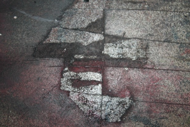 I found this image to be one if not the best image I took whilst looking for ‘Strange Places’. The quality looks amazing and professional, I particularly adore the way it gets gradually more blurred the further the image retreats. I appreciate the way all the different colours, textures and fonts make this a more imteresting image rather than making it look flat ad boring.
 This has got to be my favourite image just due to how adorable I find it. Whilst looking for faces in objects, I came across this little guy who is actually a hinge on the side of a ladder. I love the raw and pure sad emotion in his face and how it resenates with everyone who sees him. The colours look amazing and the contract of the bright yellow background and rustic browns and blacks truly enforces the sorrowful emotion the little guy puts into the world.
Macro Photography Evaluation
Throughout the short time of me studying Macro Photography, I have learnt many skills. Such as how to work a camera to my advantages and get the perfect shot. Even though I have worked with cameras for the past two years and have a small interest in photography, I have learnt more about the camera settings and what each dial does. Such as the small flower symbol means to trick your Canon camera into thinking it is a specially designed Macro camera. By learning about these features, I got the opportunity to take photographs and see things I would not been able to with the human eye.
I believe throughout this project, I have produced some decent quality images however I am fully aware I can do so much better than I did. If I got the time to do this over again, I would love to put in so much more effort and would not let what is happening around me affect my work ethic again. On the other hand, this has helped me realise that I can do so much when I put my mind to it and if I keep focused, I can produce the work I desire.
This was a relatively simple unit and one I quite enjoyed. Being able to have the freedom to go out and find things that was unique to what we could see, made this unit feel special and it was nice knowing no-one would have the same results as you. We had photograph fifteen images from four categories: Where are you?, What is it?, How does it feel? and See you?. Out of these fifteen images, we had to choose our best one from each category and say why we liked it so much and what about the composition made it a great photograph.
We also had to use a lot of digital skills in this unit surprisingly. After we had taken these photos, we chose images from each category and digitally enhanced them using Photoshop. I started off by doing subtly changes, varying the contrast and the exposure. After awhile, I got into editing to them making them look otherworldly and almost psychedelic in some. Even though I may have strayed off the task a small bit, I am happy and proud of some the edits I have produced. Some of these images, I could even use as backgrounds or references later on in my course. This is something I am planning on doing as a reference to my earlier work and I could even show how much my work has progressed.
Overall, I really enjoyed this short subject of the unit, it was fun and free and I was able to be really expressive with my editing and my photography. Even though I found it hard finding faces, it was also the highlight of the subject, being able to see faces in objects and surroundings gave me inspiration for expressions and designs for characters later on in my course.
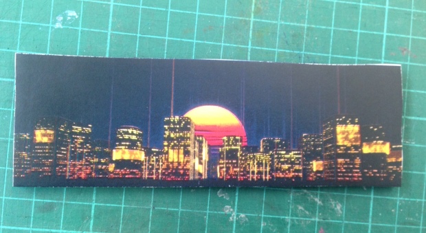
3D Landscape Model
I created a small yet effective model of a futuristic city scape and made it 3D and put perspective into it. I chose this image as I really liked the aesthetics of the image, the bright colours really make the image pop and how the composistion of the image is simple yet holds alot of detail.
I first started with four of these, each piece was going to be another layer to give it that 3D pop out affect I am after. Each of these images were spray mounted and fixed to a thick foam board to increase the strength as to make it more stable when creating the model.
I first got one of the boards and decided which part of the would fit each layer. Background. Middle-ground and foreground. Once I decided this I took a sharp blade and started slicing into the foam to get precise and clean cuts on the sky scrapers. Once I got the clean cut and cleaned up the edges I used the foam pieces that remained from cutting the boarders and used it to prop up the middle ground. This caused the middle ground to look distanced from the background and look like it was becoming more 3D.
I did the same and used a ruler to cut out the ocean reflection to make sure the cut was as straight and precise as possible. For this foreground I decided to make it look angled as to get a more powerful perspective to make it seem like it was coming out towards the viewer. To do this I used more of the discarded foam pieces and layered them at a steep angle to and used doubled sided sticky pads to stick it to the base of the the middle-ground. This propped it up at the bottom to make the bottom of the foam appear as it is coming outwards. 
After finished this I decided to create a box to enclose it all. This would force the perspectives even more and make it look cleaner and just better in general. Making it a small model of a city. I can say I am really happy with the way this one turned out and would love to do it again as I feel I could do better and create a more detailed one with more layers and a more complex image. 
Contract Sheet Of Macro Photography


This is all the photographs i took within the Macro photography lesson. I was able to complete all the tasks even though i was not able to find many faces in nature. I will most likely be going out again the next chance I get to use the cameras and when I have time, I will be collecting images in my own private time. Most of these images are blurry and i will be choosing my best 5 and explaining why they went so well and what I liked about them, such as their composition and the lighting.
Macro Pinterest Research
A selection of macro images can be viewed on my Pinterest board. This is the link to the actual site.

The rustic colours and the textures of the composition, makes it stand out. It is also a bright images for something that could have a relatively dark past. The contrast between the dials and the age old rust makes it an interesting tone. The dials stand out compared to the rest of the image.I really like how it can be put into many different categories of macro photography, faces. what is it? and texture. In the darkest part of the rust, I see a woman hair and face and the brightest parts are the ruffled sleeves onto her shoulders.
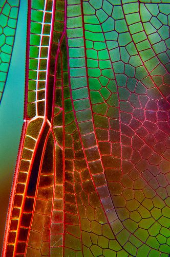
What first caught my attention to the image, was the intense almost neon colours that are being reflected off of this incests wings and the way the colours blend perfectly against each other. You can defiantly tell with the way the light is portrayed, this creature is fragile and very delicate even to look at. It shows a strange side of beauty to something we would usually find gross and disgusting. I find it really interesting to be able to see the composition of all the shapes that have gone into making up this little creatures wing.

I choose this image as I see it as an abstract piece. Personally, I think this image has a deeper meaning than what you see. To me this image represents being trapped. Running away however you cannot get far. Being held and weighed down by your own problems. The reflection can show what’s deep inside you metaphorically. I love the composition of this piece and how you really have to look at the photograph to tell what it is.

This photograph has many layers, physically and metaphorically. When I first glanced at this picture, I saw a dystopian city layered on top of each other. As the layers get darker, the more rugged and rough the city gets. This could be seen as a metaphor as it is actually the end of a lit cigarette. This could show how cigarettes ruin streets appearance and ruin the atmosphere with their sickening smell. The photos composition is relatively simple yet highly affective.
Macro Photography

Macro photography, is extreme close-up photography, usually of very small subjects and living organisms like insects, in which the size of the subject in the photograph is greater than life size
Final Background And Character

I decided to abandon everything I had done previously and create something new for my final piece. I thought it would be a good idea to do something a little bit different as a background. So I created a border. A border with small and cute icons that could relate to clowns. As it is almost Halloween while I am doing this I thought I would spook it up a little by adding wisps and bloody bows. This also appeals to the different aesthetic I wanted my Clown Character to have.

She has been drawn in two styles, anime and Chibi. I loved drawing her and giving her a happy yet cheeky expression and matching that with the Chibi on looking. Whilst I was planning this out I was thinking out anime openings and how they place things. I planned to have her placed behind the green border in front of the patterns in the centre, almost as if she’s in a picture frame.
I was also going to add another character that I drew and digitalised but I decided to not to use it as it made the whole piece look very crowded and messy. By taking that out, there is more focus on the characters and the little icons surrounding her. The reason why I chose my Clown to be female is; one, because I prefer drawing female characters and two because you never really hear about any female clowns in the entertainment world. I thought this would make my piece stand out even more with the diverse character I have.
At home I don’t have good enough materials to colour her in however she was supposed to have dark skin with bright red and blue hair. She has changed a lot since the original character I drew however I don’t think I will have time to get all of this across in my final piece and I know I do not have long. This is the first true piece I have done for this course and I am really proud of it. It may not look as good digitalised as I struggle highly with shaky hands however I am looking forward to experimenting.
Character And Background (Final)
 This is my final piece for this Get into Character assignment. I am really proud with how the characters turned out and how the background layered. I believe that the lines are smooth and it all looks very neat so professional. I would have loved to spend more time on it however I know as I progress throughout the year, I will learn new skills and be able to do everything in half the time. For now I am happy with what I have created and I may even work on it more in my own personal time.
I really enjoyed doing this type of work as it is what I would love to do as a job. Learning all the ins and outs of a new programme has really helped in my confidence and realising that everything does take time and I will get there eventually.
I struggled most with keeping the lines where I wanted on the Wacom Tablets as my hands shake a lot so I spent most of my time redoing lines over and over again. However, I did find this really calming and I didn’t get to irate over it. I wasn’t sure whether to add colour to the characters or not so I made a copy of both. I am still not sure which one I prefer.
The bright colour background with white out characters really makes them stand out and gives a nice impact and contrast. Almost like they’re empty whereas everything around them is so happy. However, the coloured version is very bright wherever you look, giving it an all over happy vibe which is what clowns are supposed to do. I am drawn between creating something that exactly fits the character given or going off it a little and creating something a bit out of the ordinary to change things up.
The piece I handed in was not to completion, I concentrated on the wrong things and I now know what I should’ve done and when. Even though it is not complete I am still happy with the way it turned out and how it looks. Even though it looks a little rushed, the piece still portrays what I want it too. I need to work on my background more, learning how to use layers proper so I don’t have to spend so much time focusing on staying in the lines while I add colour.
Third Background

This is the third background I have done and it is probably the one I am happy with most. Reason being? The way the silhouette outlines are very crisp and clean and aren’t too curved the way I usually do it. I used a ruler to create these straight lines however I was worried the paint would sink underneath as it has in some places.
It was really hard I think of another background to do for a clown, as I am very limited to knowledge of them and each clown seems to follow the same rules of dress code and event. I decided to think more about the entertainment side of it all and I immediately thought of children’s party’s. I didn’t have enough time to draw and paint a full scene so I had to do more thinking.
Whilst I was stretching the paper, I wasn’t aware that my sponge had yellow ink soaked into it. This is how the yellowy orange colour at the top of the piece came to be. At first I thought about throwing it away and starting over again but I wanted to use it to my advantage and it ended up being a good decision.
As the page looked like a sunset I decided to a silhouette of a house and add some smaller features in to make it look like a small party etc the balloons. I think this was the best thing for me to do as I only had an hour to come up with a new background and I know I would have taken time on the outlines making sure they were all perfect. I think I did particularly well on this piece and am far happier with this than the other too. I do think if I had longer I could have done so much better however that was out of my control.
